
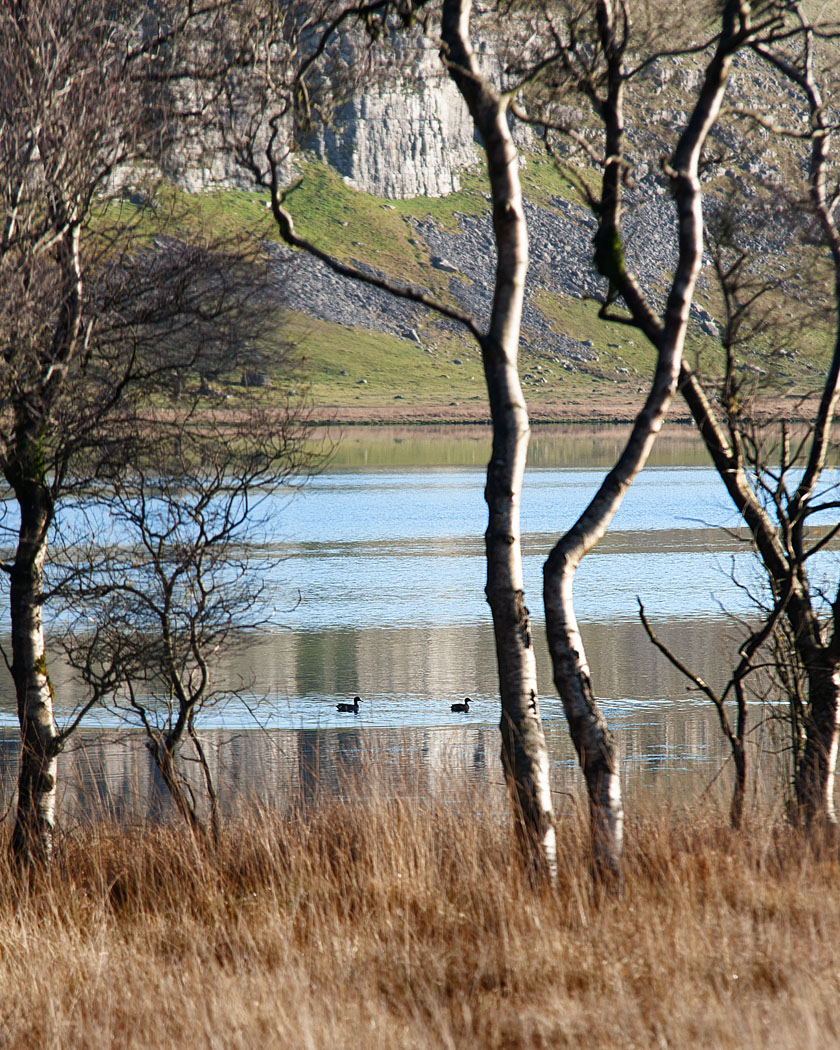
PEACE AND QUIET by ROD SMITH
As we all know to our cost, when our images have been judged, the quality of a picture is in the eye of the beholder. And so it is with my choice. Astrid’s talk, a little while back, emphasised to me the importance of balance in an image, not necessarily the subject matter but rather the feeling that everything is ‘where it should be’. Nature provides possibly the most challenging environment in which to achieve this but, when the author catches that sweet spot, it is the most rewarding.
So it is with Rod’s picture ‘Peace and Quiet’ entered in the Emotions Gallery. For me it hit the spot in a number of ways. Most obvious, of course, is the juxtaposition of the vertical and horizontal elements; and, in particular how the grass leads into the trees which bleeds into the cliff-face at the rear, all so sensitively framed by some judicious cropping. Secondly, the colours of brown, blue and green complement each other so well. And lastly, how the wind stirring the water, and the ducks, lending movement to what otherwise could be a rather static picture.
But it is the overall balance of the image on first seeing it that fully justifies the title, and the emotional affinity that we all have to this environment makes me a little jealous that Rod was there, and I was not! Great picture – spot on.
Paul Underhill